
Velocity Chart
March 1, 2025
« Back to Glossary Index
What is a Velocity Chart?
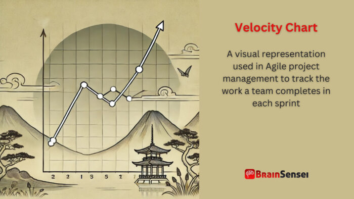
A velocity chart is a visual representation used in Agile project management to track the work a team completes in each sprint. It helps teams forecast future performance by illustrating completed story points, tasks, or hours across multiple iterations.
Key Takeaways
- Measures work completed across sprints for better performance insights
- Assists in sprint planning by predicting team capacity
- Provides transparency for stakeholders on project progress
- Highlights performance trends, enabling continuous improvement
- Essential for teams using Scrum or other Agile frameworks
Understanding the Velocity Chart
How It Works
Velocity charts display completed work over consecutive sprints, typically measured in story points or hours. Each sprint’s data point reflects the team’s productivity, helping project managers identify patterns, potential roadblocks, and realistic delivery expectations.
Notes
- Velocity varies due to team composition, task complexity, and external factors.
- Comparing different teams’ velocities may lead to inaccurate assumptions.
- A high velocity doesn’t guarantee high-quality output.
- Velocity is not a performance metric for individuals but for team progress.
Related Terms
- Sprint Planning: Forecasts tasks for the upcoming sprint using past velocity.
- Burnup Chart: Shows completed work versus total scope.
- Burndown Chart: Illustrates remaining work over time.
- Story Points: Units estimating task complexity in Agile.
- Agile Metrics: Quantitative measures like velocity, cycle time, and throughput.
Examples of Velocity Chart Usage in Different Industries
Manufacturing Industry
A manufacturing company uses a velocity chart to track production tasks across sprints. The chart reveals fluctuations in completed tasks during equipment upgrades, guiding the team in capacity adjustments to avoid delays. For example, a car parts manufacturer running sprints to improve production efficiency noticed that after introducing new machinery, their velocity dropped significantly. Upon further inspection, they discovered that employees needed additional training to use the latest equipment effectively. The velocity chart highlighted this issue early, allowing the team to address it with training sessions and restore productivity. Additionally, the chart helped identify that specific tasks were consistently underperforming, leading to process re-engineering that increased output by 15% over six months.
Healthcare & Pharmaceuticals
A healthcare IT team developing a patient portal monitors story points completed per sprint. The chart identifies slowdowns during regulatory reviews, prompting earlier compliance engagement. For instance, a director tasked a pharmaceutical company’s IT department with creating a secure platform for sharing clinical trial data. Using the velocity chart, project managers noticed recurring delays whenever documentation required legal review. The team improved sprint performance by collaborating with the legal team to create standardized templates and streamline review processes. The chart also helped the team predict timelines for future projects involving similar regulatory steps, improving overall efficiency.
Government & Public Services
A public services team uses velocity charts for a citizen services platform upgrade. The chart helps adjust sprint goals during staffing changes maintaining project timelines. In a city planning department, staff turnover frequently delays the development of an online permit application system. By analyzing the velocity chart, project leaders realized that new team members took an average of three sprints to reach full productivity. This insight led to the implementing of a structured onboarding program and mentorship system, which reduced onboarding time by 30% and helped maintain consistent velocity despite personnel changes.
Furthermore, velocity charts have proven beneficial across other industries. For example, an e-commerce company launching a new website feature in the retail sector tracked their development progress with a velocity chart. They noticed that tasks related to payment gateway integration consistently lagged behind schedule. Investigating the cause revealed that the external vendor responsible for the gateway had an inconsistent delivery pattern. The company addressed this issue by setting more explicit expectations and milestones with the vendor, significantly improving delivery reliability.
A firm in the telecommunications industry is developing a new customer portal that uses velocity charts to manage tasks across distributed teams. The chart highlighted discrepancies between teams working in different time zones. Adjusting meeting schedules and communication practices improved collaboration and resulted in a more predictable velocity.
Velocity charts are invaluable tools for project managers seeking to understand team performance, identify process bottlenecks, and make data-driven decisions to enhance productivity.
Use Cases of Velocity Chart
United States (Software Development)
An American tech firm uses velocity charts to manage feature releases. The charts highlight consistent productivity dips after holidays, prompting policy changes to balance workload. In one case, the development team noticed a sharp drop in velocity in the sprints immediately following significant holidays such as Thanksgiving and Christmas. Many team members took vacations during these periods, leaving fewer resources to handle critical tasks. The company implemented a policy to stagger vacations to address this and introduced a pre-holiday sprint planning meeting. This approach helped stabilize velocity, ensuring more consistent delivery timelines for their product updates.
The velocity chart also revealed that certain features consistently required more time than initially estimated. This discovery prompted the team to improve their estimation techniques, involving senior developers more frequently in sprint planning sessions. Over time, the accuracy of their story point estimations improved, leading to more predictable sprint outcomes and better resource allocation.
Germany (Automotive Manufacturing)
A German automaker employs velocity charts to track software integration tasks. The charts identify dependency-related delays, leading to improved cross-team collaboration. For instance, the IT team noticed consistent delays in integration tasks with third-party navigation system providers. The velocity chart indicated that these delays coincided with low communication between internal teams and external vendors.
To resolve the issue, the company established regular cross-team sync meetings and created shared dashboards to monitor task progress collaboratively. These measures helped reduce the frequency and duration of delays, ensuring smoother software integrations. Additionally, the chart highlighted the impact of software bugs on velocity, leading to the adoption of automated testing tools that significantly reduced defect rates and accelerated delivery cycles.
Singapore (Financial Services)
A Singaporean bank uses velocity charts for its mobile app development. The charts guide sprint planning by revealing optimal task distribution among teams. The development team observed that backend tasks consistently took longer than frontend tasks. By redistributing resources and providing additional training for backend developers, the team increased their average sprint velocity by 20%.
Moreover, the chart revealed that tasks related to security updates frequently disrupted sprint timelines. The bank adopted a DevSecOps approach to mitigate these disruptions, integrating security practices into the development process from the start. This proactive strategy improved productivity and ensured compliance with regulatory requirements.
The use of velocity charts also facilitated better communication with stakeholders. The team could illustrate progress and justify adjustments to project timelines by presenting the chart during review meetings. This transparency built trust and enabled more informed decision-making at the executive level.
Best Practices for Velocity Chart Implementation
Implementing best practices using a velocity chart in Agile project management can significantly improve its effectiveness. Here are several strategies, along with in-depth explanations and examples:
Regularly Update Velocity Charts After Each Sprint
Velocity charts should be updated immediately after each sprint concludes. Timely updates ensure the chart accurately reflects the team’s performance, helping stakeholders understand trends and make informed decisions. For example, a software development team at a fintech company regularly updated their velocity chart after each sprint. When they noticed a sudden drop in velocity, they quickly identified the cause. They realized that an IT manager reassigned several senior developers to another project. This real-time insight enabled management to hire temporary contractors to bridge the gap and restore productivity.
Use Historical Velocity for Realistic Forecasting
Historical data is invaluable when planning future sprints. Teams should analyze past performance to set realistic goals rather than make arbitrary estimates. A healthcare tech company found that its average velocity was 50 story points per sprint over the last 10 iterations. By using this data as a benchmark, it avoided overcommitting and successfully delivered a new patient management system on time.
Analyze Trends to Identify and Address Productivity Blockers
Velocity charts often reveal patterns that signal underlying problems. Teams should scrutinize these trends to identify recurring blockers. For instance, a logistics firm discovered a consistent dip in velocity whenever tasks involved integrating with an external API. The investigation revealed that outdated API documentation was the culprit. Updating the documentation and improving the integration process increased their velocity by 25%.
Educate Stakeholders on the Chart’s Purpose
Stakeholders unfamiliar with Agile principles might misinterpret the velocity chart as an individual performance metric. Teams should conduct training sessions to clarify that velocity reflects overall team progress. A telecommunications company introduced quarterly Agile workshops for managers and executives. This initiative reduced misunderstandings about velocity charts and fostered more productive discussions during sprint reviews.
Maintain Consistency in Estimation Techniques
Velocity is most reliable when the team uses consistent methods to estimate work. Shifting from story points to hours mid-project can skew data and hinder accurate forecasting. An e-commerce company maintained strict consistency in their estimation practices, which helped them track performance trends accurately and adapt to market demands effectively.
By following these best practices, teams can maximize the benefits of velocity charts, leading to improved project planning, better risk management, and more predictable delivery outcomes.
Common Mistakes and Issues
Misinterpreting velocity charts is a common pitfall in Agile project management. Here are several mistakes and their potential impact:
Using Velocity as an Individual Performance Metric
Velocity measures team productivity, not individual output. When companies tie personal performance evaluations to velocity, team members might inflate estimates or focus on more straightforward tasks to boost numbers. This behaviour can distort data, impair planning accuracy, and harm team morale.
Ignoring Velocity Chart Fluctuations
Variations in velocity often signal underlying issues. A software development team that ignored declining velocity discovered too late that technical debt was accumulating. Reviewing velocity trends can help teams proactively address problems.
Overestimating Future Capacity
Relying on a single high-velocity sprint for projections can lead to unrealistic expectations. For more reliable forecasting, teams should use the average from multiple sprints.
Lack of Context in Analysis
Velocity alone doesn’t explain why performance changes. For example, an infrastructure team saw reduced velocity after introducing new security protocols. Deeper analysis revealed that learning new processes was lost, highlighting the importance of context.
Comparing Teams Without Adjusting for Differences
Comparing velocities across teams can be misleading if their tasks differ in complexity and context. Leadership should avoid these comparisons and focus instead on trends within each team.
By recognizing and addressing these mistakes, teams can maintain more reliable and insightful velocity charts.
Frequently Asked Questions (FAQs)
What is the primary purpose of a velocity chart?
A velocity chart helps Agile teams track completed work over multiple sprints, aiding in performance analysis and future sprint planning.
How do you interpret a velocity chart?
Analyze trends in completed story points or hours across sprints. Consistent velocity suggests stable team performance, while fluctuations may indicate challenges.
Can velocity charts predict project completion?
By calculating average sprint velocity, teams can estimate remaining work timelines, assuming stable conditions.
How often should teams review their velocity chart?
Teams should review the velocity chart after every sprint to adjust plans and address issues promptly.
What factors can impact team velocity?
Team composition changes, task complexity, technical debt, and external dependencies can significantly affect velocity.
Additional Resources
Preparing for a PMI certification?
- Exam Prep Courses: PMP®, CAPM®, and PMI-ACP®
- Exam Simulators: PMP®, CAPM®, PMI-ACP®, PMI-PBA®, PMI-RMP®, PMI-SP®, PgMP®, and PfMP®
- Professional Development Units (PDUs): 15, 30, and 60 PDU Bundles