
Tornado Diagram
February 28, 2025
« Back to Glossary Index
What is a Tornado Diagram?
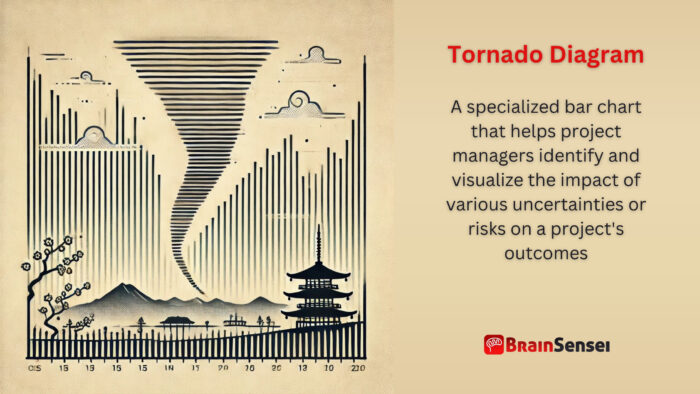
A tornado diagram is a specialized bar chart that helps project managers identify and visualize the impact of various uncertainties or risks on a project’s outcomes. It is widely used in sensitivity analysis to prioritize risks based on their potential effect on project performance.
Key Takeaways
- Provides a clear, visual representation of sensitivity analysis
- Highlights which variables have the most significant impact on project outcomes
- Aids in decision-making by prioritizing critical risks
- Named for its characteristic shape, resembling a tornado, with the most expansive bars at the top
Understanding the Tornado Diagram
How It Works
A Tornado Diagram ranks variables based on their influence on a particular outcome, such as cost, time, or performance. Bars represent the potential variation caused by changes in each variable, ordered from most impactful to least impactful. This visualization helps project managers focus on the most critical risks.
Notes
- Variables with the longest bars indicate high-impact uncertainties
- Used extensively in risk management and cost-benefit analysis
- Requires accurate input data for reliable results
- The Tornado Diagram simplifies complex risk analysis, providing a clear and straightforward way to communicate with stakeholders. This reassures project managers that they can effectively manage and mitigate risks, fostering a sense of ease in their project management roles.
Related Terms
- Sensitivity Analysis: Evaluates how changes in input variables affect project outcomes
- Monte Carlo Simulation: A probabilistic method often used with Tornado Diagrams to assess risk
- Risk Register: A document tracking identified risks, their impact, and mitigation strategies
- Decision Tree Analysis: A technique for evaluating decisions based on possible outcomes
- PERT Analysis: A project management tool for time estimation and task dependency analysis
Examples of Tornado Diagram Use in Various Industries
Construction Industry
In a large-scale residential development project, the project manager uses a Tornado Diagram to analyze risks related to material costs, labour availability, and regulatory changes. The diagram reveals that material costs impact the project’s budget, prompting the team to secure long-term supplier contracts.
For instance, during the planning phase of a high-rise building in New York City, the project team identified three primary cost drivers: steel prices, labour costs, and permit fees. Sensitivity analysis showed that a 15% increase in steel prices could push the project over budget. In response, the team negotiated bulk purchase agreements and explored alternative materials. The Tornado Diagram helped illustrate the potential financial impact on senior executives, facilitating informed decision-making.
Additionally, the team revisited the diagram at key milestones to reassess risks. The diagram clearly showed the potential schedule impact when labour shortages emerged due to external economic factors. This review prompted the company to collaborate with local trade schools to secure skilled workers.
Healthcare Sector
A hospital construction project employs a Tornado Diagram to assess uncertainties in equipment procurement and staffing needs. The analysis indicates staffing shortages are the primary risk, leading to early recruitment initiatives.
The project team faced uncertainties regarding the availability of specialized medical equipment when constructing a new pediatric wing in Chicago. The Tornado Diagram highlighted equipment delivery as a significant concern due to potential delays from international suppliers. As a proactive measure, the procurement team established contingency contracts with multiple suppliers and adjusted the project schedule to accommodate possible delays.
Furthermore, when staffing projections indicated potential nurse shortages, the hospital partnered with local nursing schools and offered incentives for early applications. The visual clarity provided by the Tornado Diagram helped hospital administrators grasp the urgency of these issues and approve necessary adjustments.
Telecommunications Industry
A telecom company planning a new network infrastructure uses a Tornado Diagram to evaluate potential delays in equipment delivery, installation issues, and permitting processes. Equipment delivery emerges as the most critical factor, guiding the team to engage with multiple suppliers.
For example, in a nationwide 5G rollout project in Canada, the project management team utilized Tornado Diagrams to analyze regional variations in permitting processes. The analysis revealed that metropolitan areas faced prolonged approval timelines, significantly affecting deployment schedules. To expedite the process, the company hired local consultants who were familiar with municipal regulations.
Additionally, the diagram highlighted the risk of component shortages due to global supply chain disruptions. This insight led to the strategic decision to increase inventory levels of critical components, ensuring the project remained on schedule. The tangible impact of these decisions was later measured by comparing projected versus actual deployment timelines, with the diagram serving as a reference point for lessons learned.
Use Cases of Tornado Diagram Use Worldwide
United States (Energy Sector)
A solar power plant project in California applies a Tornado Diagram to identify risks related to weather variability, equipment costs, and policy changes. The diagram highlights policy uncertainty as the biggest concern, prompting the team to work closely with regulatory bodies.
The project team initially identified over twenty potential risks, but through sensitivity analysis, three key concerns stood out: changes in solar panel prices, variations in solar irradiance, and regulatory shifts. The Tornado Diagram revealed that regulatory uncertainty posed the greatest threat to the project’s timeline and profitability. Consequently, the project manager initiated regular meetings with state energy regulators and participated in industry advocacy groups to stay informed about potential policy changes.
Additionally, the diagram was instrumental in communicating risk factors to investors. By showing how a change in tariff policies could impact project returns, the team secured support for diversifying suppliers and adopting a more resilient procurement strategy.
Germany (Automotive Manufacturing)
A German automaker utilizes a Tornado Diagram during the development of a new electric vehicle. Battery cost fluctuations top the risk list, leading to a strategic partnership with a battery supplier.
The automaker analyzed variables such as raw material costs, production yields, and charging infrastructure availability in this case. The Tornado Diagram demonstrated that cobalt and lithium prices significantly influenced the production cost. This insight prompted the company to negotiate long-term contracts with mining firms and explore alternative battery chemistries.
Furthermore, the Tornado Diagram guides internal resource allocation, giving project managers a sense of control over their project outcomes. By visualizing how production delays could impact the market launch, the company allocated additional resources to the supply chain team. This proactive approach minimized disruptions and ensured timely delivery, reinforcing the project manager’s sense of control.
Japan (Infrastructure Development)
A Tokyo-based infrastructure project uses a Tornado Diagram to manage risks associated with land acquisition, material costs, and labour availability. Land acquisition issues are the most significant risk, resulting in early negotiations with property owners.
The project involved constructing a new subway line through densely populated districts. The Tornado Diagram revealed that delays in securing land rights could double project costs due to construction standstills. As a countermeasure, the project team engaged legal experts and initiated community outreach programs to build public support.
The diagram also played a critical role during project reviews. The team successfully obtained additional funding to expedite land acquisition activities by presenting visual evidence of potential cost overruns.
Best Practices When Using Tornado Diagram
Implementing Tornado Diagrams requires a systematic approach to ensure accurate results and valuable insights. Below are essential best practices, each explained in detail:
Ensure Data Accuracy
Accurate input data is critical for reliable sensitivity analysis. Inaccurate or incomplete data can lead to misleading results, causing project managers to misallocate resources. Therefore, the team should regularly validate data sources. Use historical performance data when available. For example, in a construction project, incorrect cost data for raw materials can underestimate budget risks, leading to financial shortfalls.
Engage Key Stakeholder
Involve stakeholders early in the risk identification process. Their insights can highlight overlooked variables and enhance the diagram’s relevance. Conduct collaborative workshops and brainstorming sessions to gather diverse perspectives. For instance, developers, testers, and product owners can uncover critical technical dependencies in an IT project.
Use the Diagram Alongside Other Tools
While Tornado Diagrams are powerful, they work best with other risk management tools like Monte Carlo simulations and decision trees. Combining these tools provides a more comprehensive view of project uncertainties. A pharmaceutical company, for example, might use Tornado Diagrams to identify key risks and Monte Carlo simulations to estimate probability distributions.
Regularly Update the Diagram
Project conditions evolve, and so do associated risks. Schedule periodic reviews of the Tornado Diagram to incorporate new data and adjust risk assessments accordingly. In a software development project, adding new risks, such as cybersecurity threats, ensures the diagram remains relevant throughout the project lifecycle.
Prioritize Communication and Visualization
The primary strength of a Tornado Diagram lies in its clarity. Use straightforward language and intuitive visuals to communicate findings to stakeholders. Supplement the diagram with narratives that explain the significance of each variable’s impact. For instance, presenting the diagram alongside customer demographic analyses in a retail expansion project can make insights more actionable.
Tailor the Diagram to Project Needs
Customize the Tornado Diagram based on the project’s context and objectives. Select variables that align with strategic goals and consider industry-specific factors. In aerospace projects, fuel price variability is more critical than staffing availability.
Document Insights and Decisions
Keep records of insights gained from the Tornado Diagram and subsequent decisions. This documentation serves as a reference for future projects and audits. In healthcare facility construction, the team tracks equipment procurement risks and their mitigation strategies to help inform similar projects later.
Failure to follow these practices can lead to significant project setbacks. For example, in a renewable energy project, the absence of regular diagram updates caused the team to overlook a surge in component prices. As a result, procurement costs exceeded the budget by 20%, delaying project completion.
Common Mistakes and Issues
Understanding the common pitfalls when using Tornado Diagrams is crucial for effective project risk management. Here are some common mistakes and issues that project managers might encounter, along with strategies to avoid them.
Inaccurate Data Inputs
Tornado Diagrams are only as accurate as the data used to create them. The diagram’s insights become unreliable if the input data is flawed, outdated, or incomplete. For example, a construction project underestimating the potential fluctuation in steel prices may encounter significant budget overruns. Project teams should establish robust data validation procedures to mitigate this risk, regularly update their datasets, and cross-verify information from multiple sources.
Overlooking Smaller Risks
While Tornado Diagrams prioritize the most significant risks, neglecting minor risks can lead to cumulative negative impacts. For instance, in an IT infrastructure project, the manager might focus heavily on server capacity concerns while disregarding minor software compatibility issues. Over time, these overlooked risks can cause delays and increased costs. A balanced approach requires monitoring more minor risks alongside major ones to understand their collective effect on the project’s success.
Miscommunication with Stakeholders
Tornado Diagrams simplify complex risk relationships through visual representation, but miscommunication can occur if stakeholders misinterpret the chart. For example, non-technical stakeholders might misread sensitivity values or overlook the significance of the bar lengths. To address this, project managers should include explanatory notes, conduct briefings, and encourage feedback to confirm understanding.
Static Analysis and Lack of Updates
Projects are dynamic, and risks evolve throughout the lifecycle. A common mistake is treating the Tornado Diagram as a one-time exercise. A pharmaceutical development project that fails to update the diagram when new regulatory requirements emerge may face unexpected compliance costs. Best practices involve scheduling periodic reviews and integrating the diagram into regular project management activities.
Over-Reliance on the Diagram
While Tornado Diagrams provide valuable insights, they should not be the sole tool for risk assessment. Project teams that rely exclusively on Tornado Diagrams without supplementing their analysis with Monte Carlo simulations or historical project data may overlook complex risk interactions. Integrating multiple risk assessment tools offers a more comprehensive perspective.
Improper Prioritization of Risks
The Tornado Diagram prioritizes risks based on impact but does not account for probability. For instance, in an energy infrastructure project, a high-impact risk with a low probability of occurrence might overshadow a moderate-impact risk with a high probability. To counteract this, teams should cross-reference Tornado Diagrams with probability matrices and scenario analyses.
Inconsistent Data Sources
Consistency in data sourcing ensures the reliability of the Tornado Diagram. Disparate data sources, especially in global projects, can cause discrepancies. For example, a multinational logistics firm that uses different forecasting models across regions might create contradictory risk assessments. Establishing standardized data collection protocols can help mitigate this issue.
Avoiding these common mistakes requires a proactive, well-rounded approach to risk management. Project managers can maximize the utility of Tornado Diagrams in decision-making by ensuring data accuracy, communicating findings clearly, updating diagrams regularly, and combining multiple analysis tools.
Frequently Asked Questions (FAQs)
What is the purpose of a Tornado Diagram?
A Tornado Diagram visually ranks variables based on their impact on a project’s outcome, helping project managers identify and prioritize critical risks.
How is a Tornado Diagram constructed?
It is created by calculating the effect of changes in each input variable on a target outcome and arranging the variables in descending order of impact.
Why is it called a Tornado Diagram?
The diagram’s shape resembles a tornado, with the most expansive bars at the top and narrower bars below, representing decreasing impact.
How does it support decision-making?
Project managers can effectively allocate resources and develop targeted mitigation strategies by identifying the most influential factors.
Can Tornado Diagrams be used in all industries?
Yes, they are applicable in any field involving risk and sensitivity analysis, from construction to healthcare to IT.
Additional Resources
Preparing for a PMI certification?
- Exam Prep Courses: PMP®, CAPM®, and PMI-ACP®
- Exam Simulators: PMP®, CAPM®, PMI-ACP®, PMI-PBA®, PMI-RMP®, PMI-SP®, PgMP®, and PfMP®
- Professional Development Units (PDUs): 15, 30, and 60 PDU Bundles